It. Is. Time!
Sorry for the delay, but we are back again with another edition of Racer Review! Every week we take a look at what fashion is being sported on the blocks of Platform Racing.
I will be ranking 1/5 from now on, cause from 7-10 I was finding myself just grading on my personal opinion (cause who would do that?!) so if a look is fully realized but still not my personal favorite, they will get an appropriate score.
This week's looks are from: PR2
First thing's first: Titanium
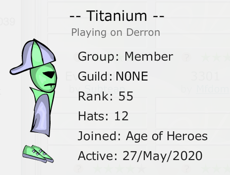
An intriguing look: soft but make it goth. I'm getting Cool Kids by Echosmith vibes, the colors have a pastel look but we have a popped collar saying "but I mean business, too". I can see several fashion influences in this look, and I dig it.
![[Image: tumblr_psz8jlJBvu1tkq8ui_540.jpg]](https://66.media.tumblr.com/ec42618ae043c60be03e3c08a7fb2a54/tumblr_psz8jlJBvu1tkq8ui_540.jpg)
A dedication to aesthetic, I respect it: 4/5.
"But how can I up my score?" I would play around with different torso body parts to see if you can keep the Cool Kid look but amping it up.
Secondly...: a7x3
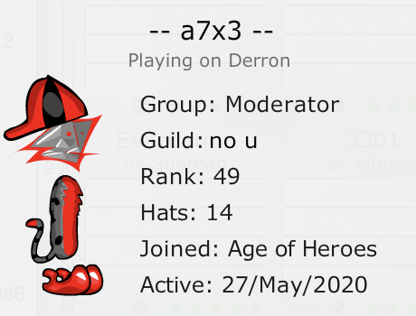
Jack and Jill went up the hill, and only Jill came back. Visually, Jack got very, very lost.
These colors! My EYES!! The shapes! I suddenly have vertigo and I'm falling over.
I'm afraid to say, but it's a 1/5 from me. It's a consistent color palette, point for that!
"But how can I up my score?" Honestly... I wouldn't bother. Scrap the whole look at start fresh.
Get ready for: Dev52
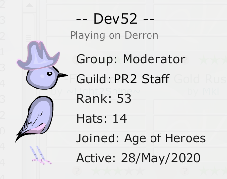
This look is by far my favorite I've seen so far. I love the colors, I love the cohesive body parts, and even the hat doesn't detract from this look at all. It's cute, it's relevant, and most of all, it's responsible. Respect birds, okay?
Unequivocally a 5/5.
Don't count me out: Prince Ande
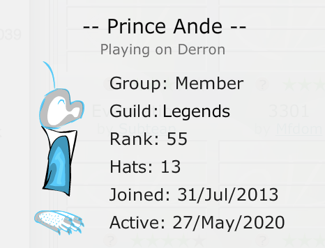
I like this ghostly, w i s p y look, especially with the blue. I know there is a story here, but it's getting lost. I want to know the real Prince Ande. Maybe some time spent in the mountains will fix that.
A comfortable 3/5.
"But how can I up my score?" Try to change up the torso body part and solidify that story.
Last but not least: ClassyElephant
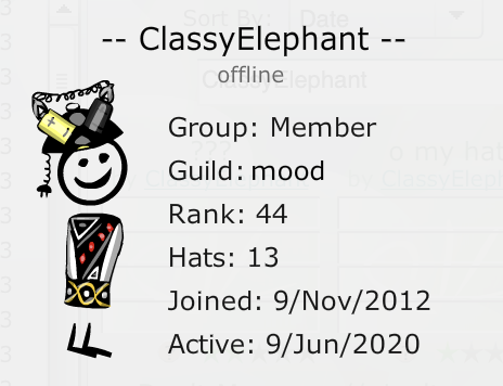
It's refreshing to see a different kind of look in this review, something away from the cute colors that I am so fond of. It pushes me to look at a new perspective, a new way of life.
The only thing that stands out to me is that the feet look like a default pick, like N0 effort went into it. In order to maximize your score, every detail must be considered!
That puts your score at around a 3/5. Nothing to scoff at!
"But how can I up my score?" Switch up the feet, and see what you can do to tie it in with the hat and torso.
As always, thanks for reading! I hope you enjoyed this week of Racer Review! If you have been previously reviewed and have a new look to show the class, let me know!
If you were mentioned in this post and wished to be removed: PM me and I can do this. This is just for fun. Love y'all!
Sorry for the delay, but we are back again with another edition of Racer Review! Every week we take a look at what fashion is being sported on the blocks of Platform Racing.
I will be ranking 1/5 from now on, cause from 7-10 I was finding myself just grading on my personal opinion (cause who would do that?!) so if a look is fully realized but still not my personal favorite, they will get an appropriate score.
This week's looks are from: PR2
First thing's first: Titanium
An intriguing look: soft but make it goth. I'm getting Cool Kids by Echosmith vibes, the colors have a pastel look but we have a popped collar saying "but I mean business, too". I can see several fashion influences in this look, and I dig it.
![[Image: tumblr_psz8jlJBvu1tkq8ui_540.jpg]](https://66.media.tumblr.com/ec42618ae043c60be03e3c08a7fb2a54/tumblr_psz8jlJBvu1tkq8ui_540.jpg)
A dedication to aesthetic, I respect it: 4/5.
"But how can I up my score?" I would play around with different torso body parts to see if you can keep the Cool Kid look but amping it up.
Secondly...: a7x3
Jack and Jill went up the hill, and only Jill came back. Visually, Jack got very, very lost.
These colors! My EYES!! The shapes! I suddenly have vertigo and I'm falling over.
I'm afraid to say, but it's a 1/5 from me. It's a consistent color palette, point for that!
"But how can I up my score?" Honestly... I wouldn't bother. Scrap the whole look at start fresh.
Get ready for: Dev52
This look is by far my favorite I've seen so far. I love the colors, I love the cohesive body parts, and even the hat doesn't detract from this look at all. It's cute, it's relevant, and most of all, it's responsible. Respect birds, okay?
Unequivocally a 5/5.
Don't count me out: Prince Ande
I like this ghostly, w i s p y look, especially with the blue. I know there is a story here, but it's getting lost. I want to know the real Prince Ande. Maybe some time spent in the mountains will fix that.
A comfortable 3/5.
"But how can I up my score?" Try to change up the torso body part and solidify that story.
Last but not least: ClassyElephant
It's refreshing to see a different kind of look in this review, something away from the cute colors that I am so fond of. It pushes me to look at a new perspective, a new way of life.
The only thing that stands out to me is that the feet look like a default pick, like N0 effort went into it. In order to maximize your score, every detail must be considered!
That puts your score at around a 3/5. Nothing to scoff at!
"But how can I up my score?" Switch up the feet, and see what you can do to tie it in with the hat and torso.
As always, thanks for reading! I hope you enjoyed this week of Racer Review! If you have been previously reviewed and have a new look to show the class, let me know!
If you were mentioned in this post and wished to be removed: PM me and I can do this. This is just for fun. Love y'all!


![[Image: 8bs0tw4.png]](https://i.imgur.com/8bs0tw4.png)


![[Image: GLPGqRm.png]](https://i.imgur.com/GLPGqRm.png)
![[Image: X9V79qt.png]](https://i.imgur.com/X9V79qt.png)
![[Image: VnNsnRk.gif]](http://i.imgur.com/VnNsnRk.gif)
